How we created a fresh look to reflect our core values.
Have you noticed our fresh new look?
Our rebrand marks an important step in the evolution of DataTribe. Founder Nick Guebhard launched DataTribe five years ago, in 2015. Since then we’ve grown and taken on many more clients. Each new addition has shaped what DataTribe is all about, where we focus and what we bring to the table.
The five-year anniversary felt like the right time to consolidate our voice and update our visual style.
From the beginning
Ever since its inception DataTribe has done things differently. We value ideas from all sources, even down to naming the company.
The DataTribe name came about through a crowd-sourcing process. Nick went out and asked for names, then took a shortlist to people he respected in the industry. The name DataTribe won.
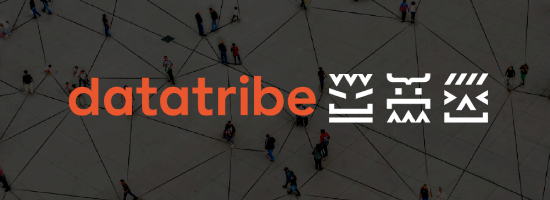
The brand was then developed by Russell Johnson, who did an amazing job with the original concept of a totem pole using code characters. The brand highlighted our passion for analytics without being too serious. We also wanted a boutique, quality feel as we deliver bespoke services.
The brand worked well, but five years on it was time to make some changes.
We have grown and taken on new clients, so we wanted to include how they’ve shaped DataTribe. Some practical aspects needed tweaking, such as the totem pole logo not working in landscape format and the yellow brand colour. Yellow isn’t easy to work with on white backgrounds. It ends up looking washed out which didn’t do justice to the vibrancy of our brand.
The rebranding process
As this was an evolution not a revolution, we wanted to maintain the original elements with a shift of focus to tribe and community.
To kick off the process, Russell produced some concepts to point us in the right direction. Excited by the rough drafts, we engaged Tim Archer of Glue Design. Tim is a senior designer who deeply understands both brand and digital experiences.
Tim worked with us to explore the existing elements. The process gave us a chance to step back and distil our core values. From there Tim developed them into a functional, visual style.
We also brought in Kelly Sharp from Sharp Copy to find DataTribe’s voice. As a professional who knows us well, she captured our professional confidence, in an organic, friendly tone.
The heart of DataTribe
Through this process we’ve been able to focus on what makes us DataTribe. This isn’t just navel-gazing. There is value in being able to articulate the who we are and services we provide. Our refreshed brand allows us to attract like-minded clients who want to be part of our tribe.
We’re all about connectivity. Our focus on ‘tribe’ is about valuing everyone’s input. We bring the skills of our whole tribe to our clients. We’re all here to do the best work for them.
The new-look DataTribe
We love it.
Our brand is fresh, dynamic and uniquely us. Each element maintains our unique balance of absolute expertise coupled with relaxed nerdiness. Our typeface and lockup are clear at any size and our tribal faces remain as the core of who we are.
Although we work with data, we’re about building a community of data enthusiasts. The vibrant colour and simple structures showcase our enthusiasm and focus on connectivity.
We’re all pleased with the brand progression. Nick sums it up by saying, “With our new brand and logo the team feels proud of our new identity and presence. It captures the energy and digital skill that makes DataTribe unique.”